
Brands built to stand apart.
Four concept identities for coaches and consultants. Each one starts from a problem I see again and again in coaching brands, and shows how I’d solve it, from strategy to the finished pieces. Client projects will join them here as they launch.
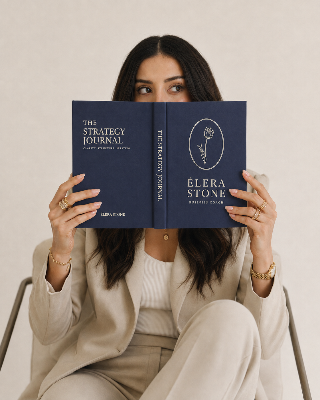
From generic coaching aesthetic to editorial authority.
A business clarity coach whose work is rigorous and structured, and a brand built to show it: deep violet, editorial type and the restraint of a considered practice.
View project →
From inspiration-poster softness to structured confidence.
A life coach whose method treats confidence as a discipline, and a brand that says so: deep burgundy, restrained type and a calm, firm presence.
View project →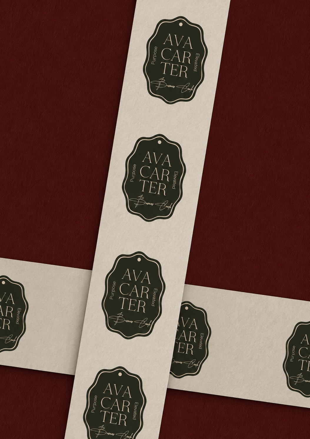
From personal development aesthetic to boardroom-grade authority.
An executive coach for senior leaders, and a brand built for the boardroom rather than the wellness market: champagne, charcoal and quiet precision.
View project →
From corporate service provider to decisive strategic partner.
A leadership consultancy built around momentum: a geometric monogram, a warm terracotta palette and a system that runs from business cards to signage.
View project →Strategy first. Then the look.
Strategy
Who you help, what you sell, how you want people to feel, and what isn’t working now. The design answers those questions.
Identity system
Logo suite, colour, typography and the rules that hold them together, so your brand looks like one business everywhere.
Applied everywhere
Website, social, stationery and documents, so the first impression and the fiftieth one say the same thing.
Ready to be the next one here?
If your coaching is ahead of your brand, let’s close the gap.