
NXT
Redefining leadership brands from corporate presence to strategic momentum.

A consultancy that moves leaders forward needed a brand that moved.
NXT operates in leadership consulting and coaching. Its work is directional — it does not advise clients to think differently, it moves them toward what is next.
The original brand identity did not reflect this. It was corporate and interchangeable — the visual language of a service provider, not a strategic partner. Navy, grey, and serif convention. The kind of brand that looks credible in a pitch deck and forgettable everywhere else.
The new identity was built around a single principle: leadership is movement.
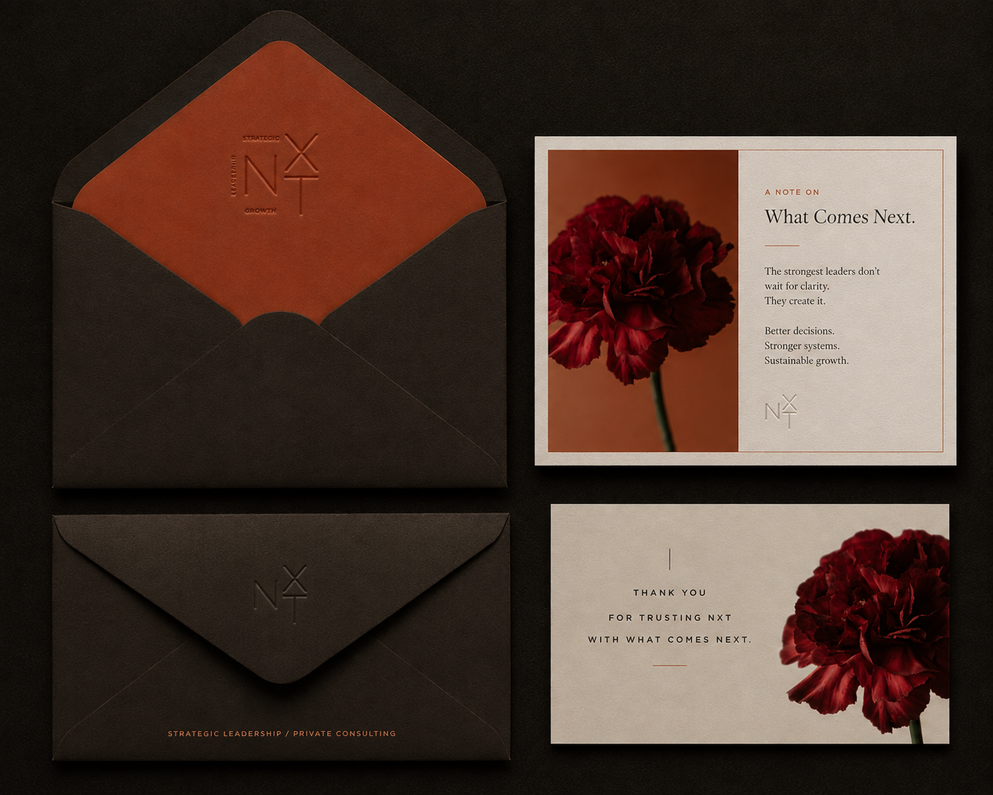
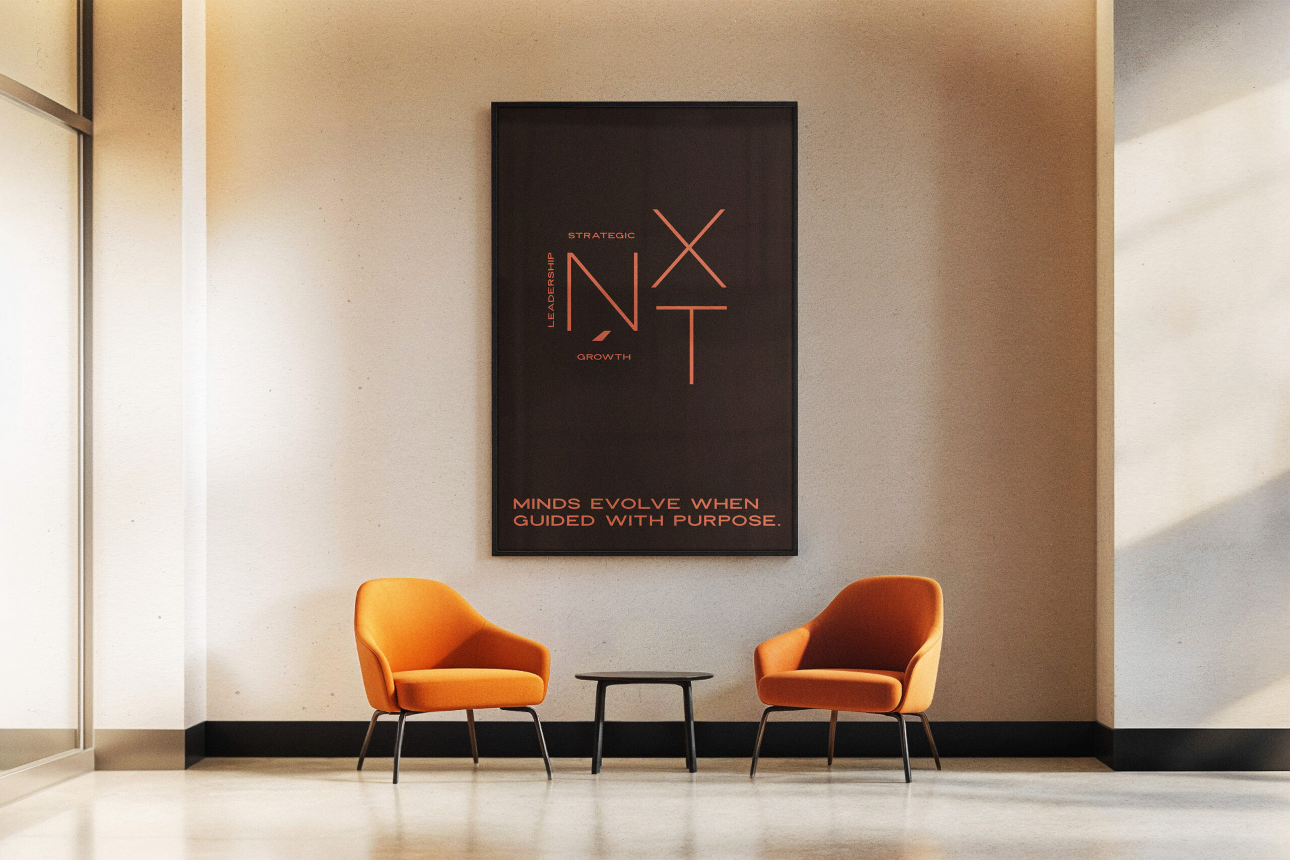
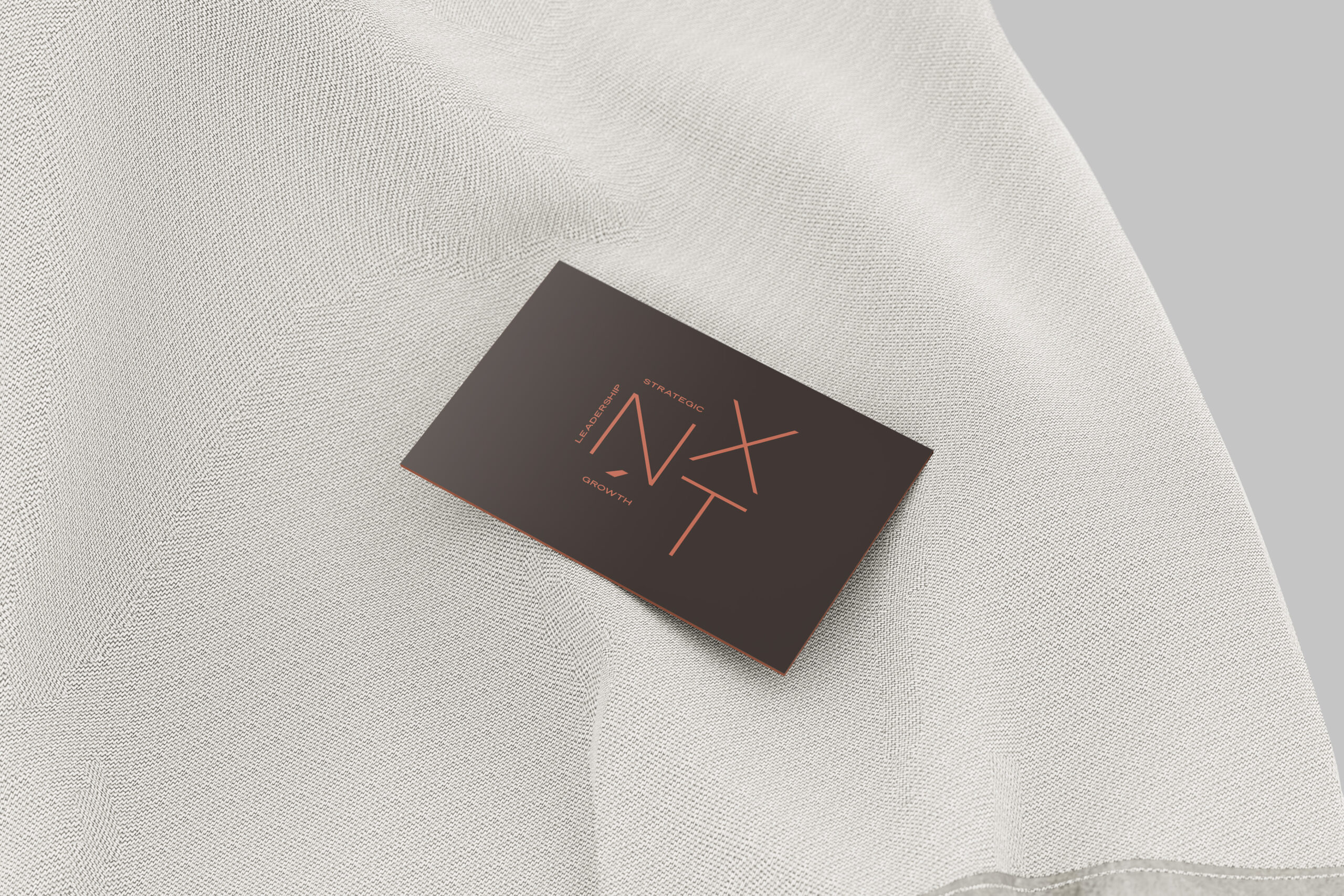
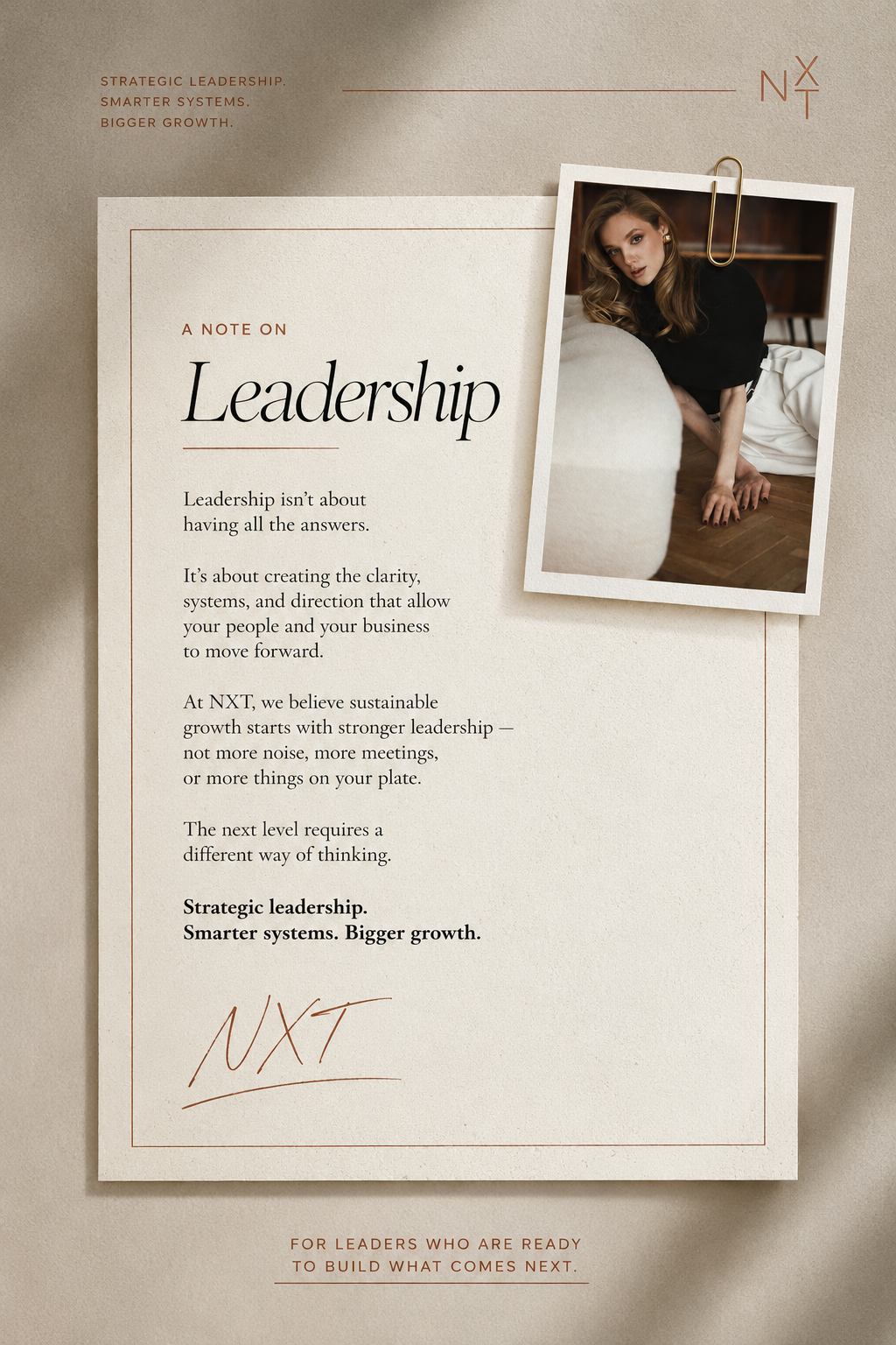
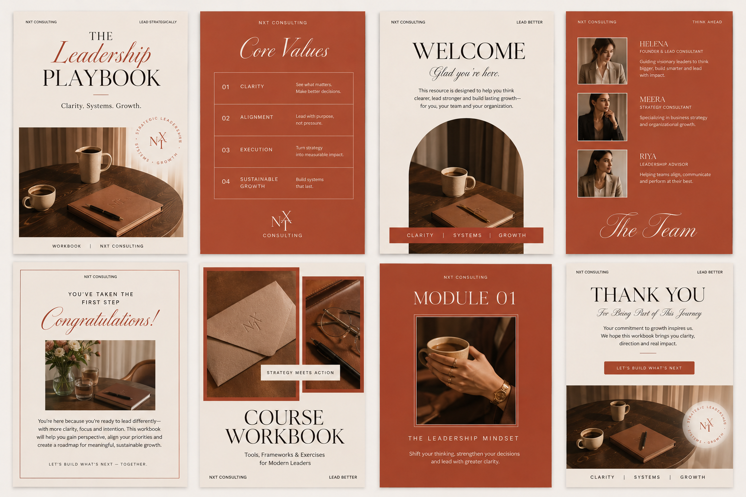
A geometric monogram — designed to suggest navigation, progression, and forward momentum through deliberate line weight and spacing. A warm terracotta palette that steps deliberately away from conventional corporate blues: warmth, courage, and human ambition, without sacrificing confidence or structure.
Across signage, stationery, and environmental graphics, the brand communicates intent with restraint. It moves without rushing. It leads without announcing itself.
NXT no longer looks like a consultancy. It looks like the destination.
Leadership Consultancy & Executive Coaching Firm
Strategic Consulting & Organisational Leadership
Brand Identity · Environmental Graphics · Visual Strategy · Brand Guidelines
Logo Suite · Colour System · Typography · Stationery · Signage · Environmental Graphics · Brand Guidelines PDF
Corporate service provider → Decisive strategic partner
Minds evolve when guided with purpose. Brands, too.