SELECTED WORK
Brands built to stand apart.
A curated selection of brand identities and visual systems designed for coaches and consultants who refused to blend into their market.
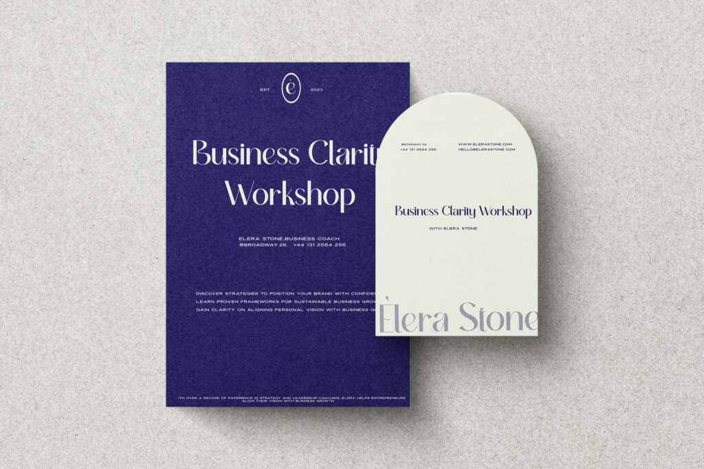
From generic coaching aesthetic to editorial authority.
A business clarity coach and workshop facilitator with a growing reputation and a brand that no longer reflected it. The new identity centres editorial depth — deep violet, structured typography, and the restraint of a considered practice.
From inspiration-poster softness to structured confidence.
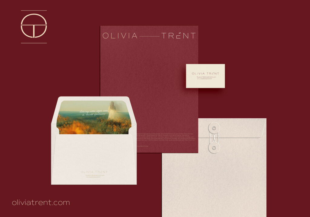
A life coach whose methodology is built on discipline and self-possession — but whose brand communicated generic warmth. The rebrand repositioned her around confidence: deep burgundy, restrained typography, and a presence that signals authority before a word is read.
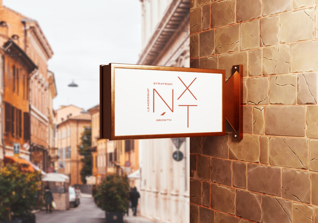
NXT · BRAND IDENTITY & ENVIRONMENTAL GRAPHICS
From corporate service provider to decisive strategic partner.
A leadership consulting firm whose original identity looked like every other consultancy. The new direction was built around movement and momentum — a geometric monogram, warm terracotta palette, and an identity system that extends from business cards to exterior signage.
From personal development aesthetic to boardroom-grade authority.
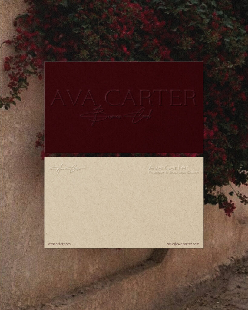
An executive and leadership coach whose previous brand borrowed the visual language of life coaching. The new identity is built for a different buyer — restrained, material, and precise. Champagne, charcoal, and the quiet confidence of a brand that opens rooms before the conversation starts.