
Olivia Trent
A coaching brand redefined through confidence, clarity, and disciplined elegance.

Not a rebrand. A repositioning.
Olivia Trent’s coaching practice was built around a specific belief: that confidence is not a personality trait — it is a discipline. Her clients paid for structure, accountability, and results. But her brand told a completely different story. Soft colours. Generic visuals. An aesthetic shared by a thousand other life coaches. The identity communicated warmth, but not authority. And for a coach whose method is built on self-possession, that gap was costing her the clients she was built to serve.
The solution was to let the brand say what her methodology already said: growth is earned, not inspired.
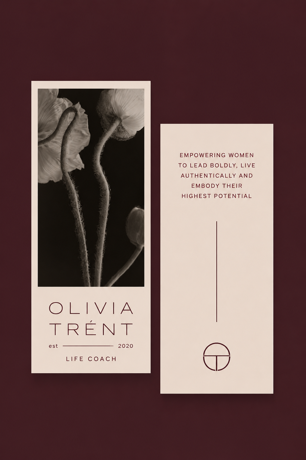
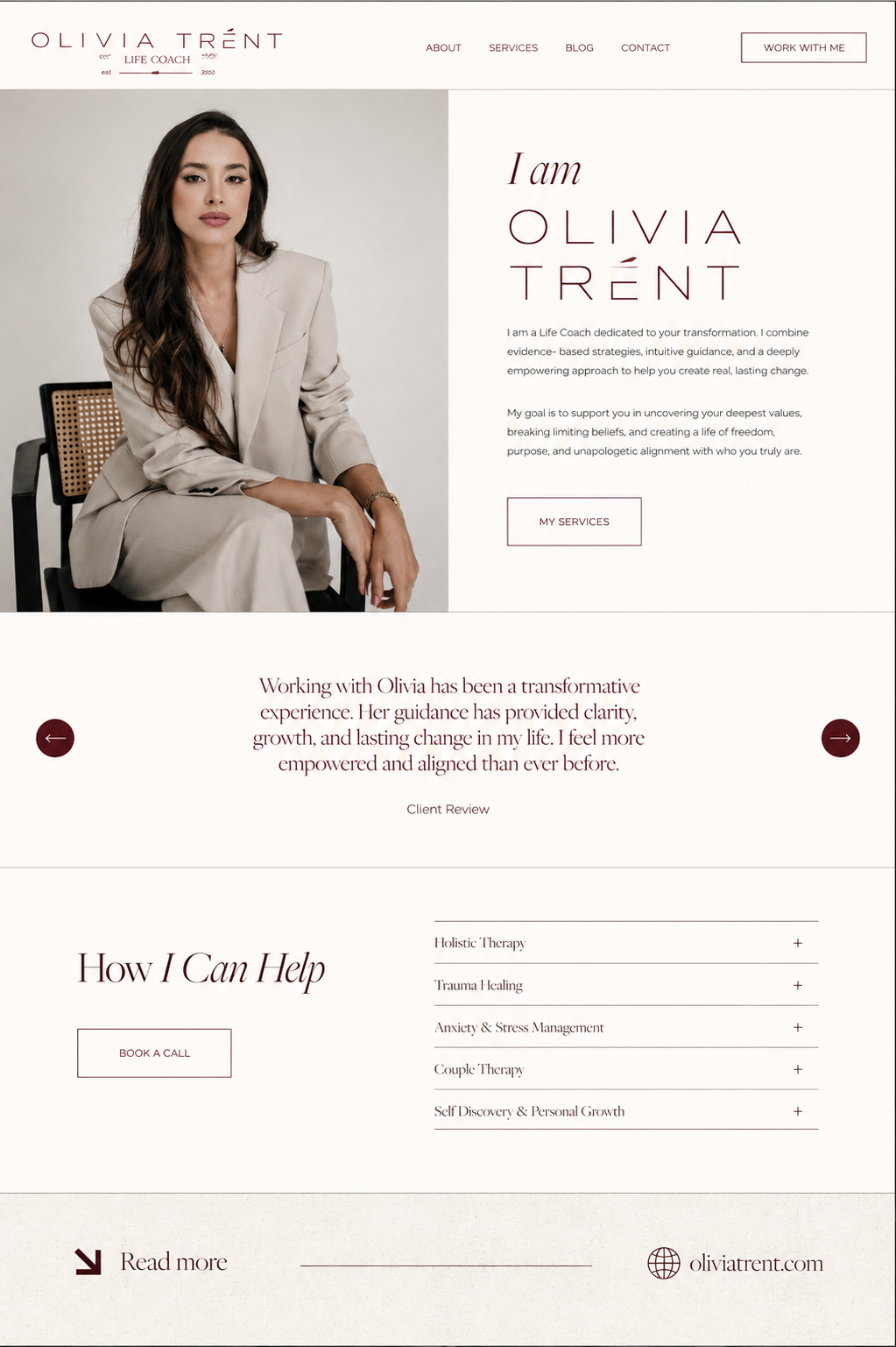
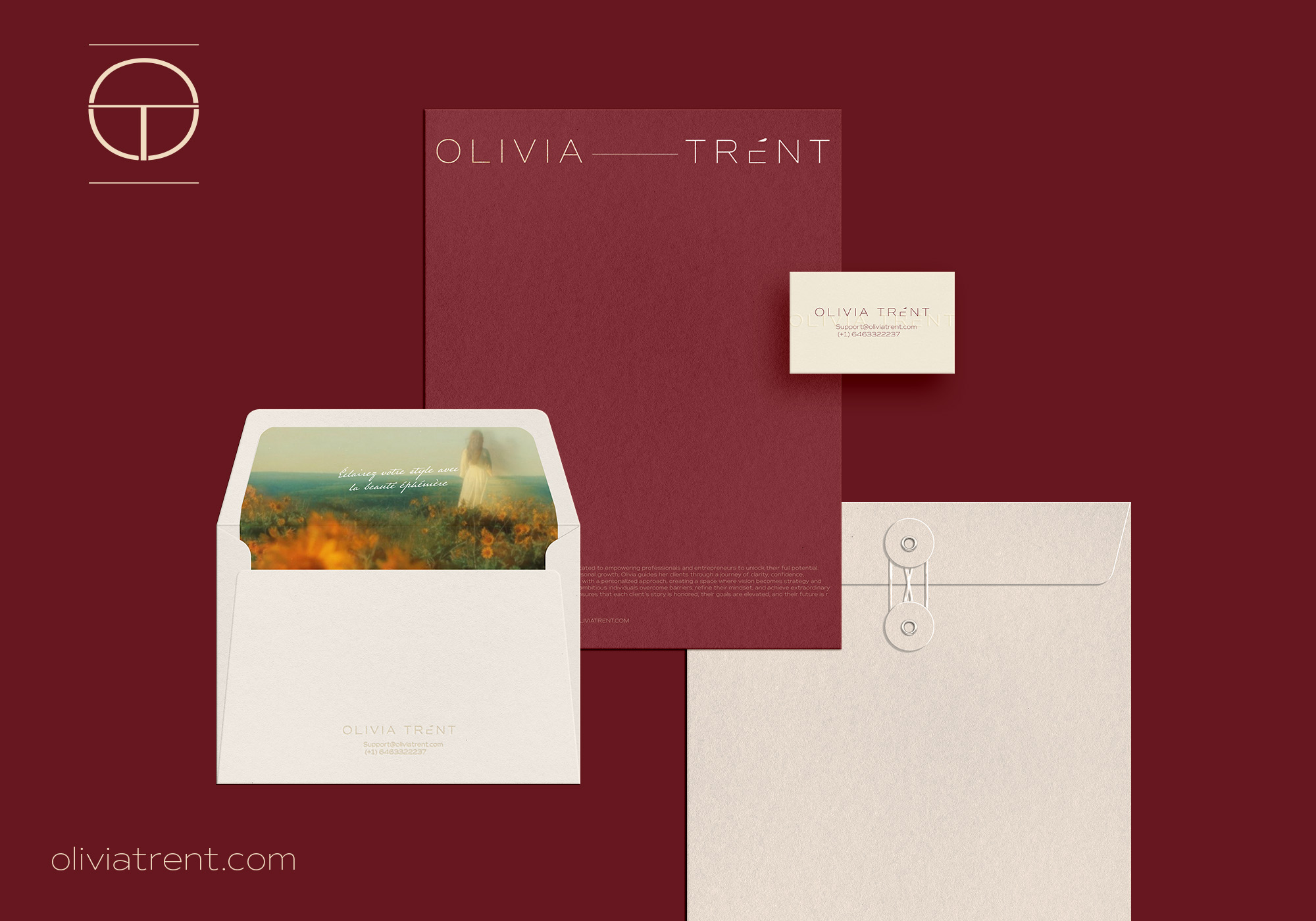
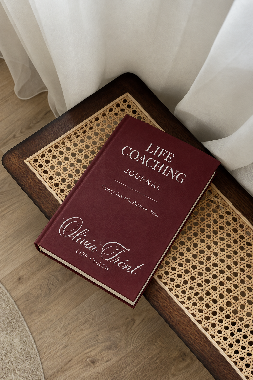
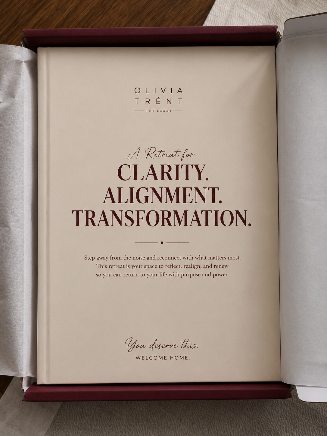
Deep burgundy replaced soft neutrals. Restrained typography replaced decorative fonts. The layout became structured and deliberate — no excess, no softness for its own sake. The stationery, website visuals, and colour system create a presence that is calm but non-negotiable.
Olivia Trent’s brand no longer blends into the wellness market. It stands apart from it — on purpose.
Life Coach — confidence and self-possession methodology
Coaching & Personal Development
Brand Identity · Visual Strategy · Brand Guidelines
Logo Suite · Colour System · Typography · Stationery · Brand Guidelines PDF
Inspiration-poster aesthetic → Structured confidence

Confidence is not a feeling. It is a decision — and a brand can make it for you.