
Élera Stone
Brand identity designed to position expertise as authority.
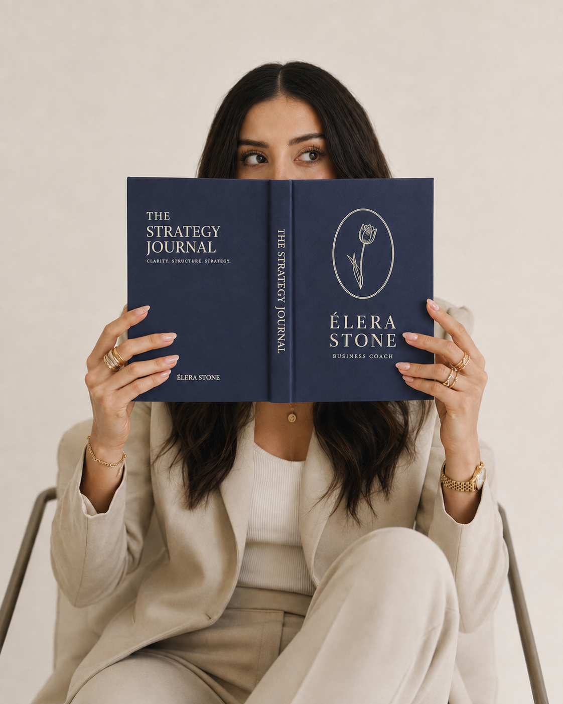
The problem wasn’t the positioning. It was the proof.
Élera Stone had built a legitimate reputation as a business clarity coach and workshop facilitator. Her clients achieved real results. Her referrals were consistent. But her brand didn’t communicate any of that — it looked like every other coach in the space.
Generic visuals. Soft palettes. No visual expression of the rigour, structure, or intellectual depth that her actual work required. She was operating at a premium level with a brand that signalled entry-level.
The solution was not a rebrand for aesthetics. It was a repositioning through visual language.
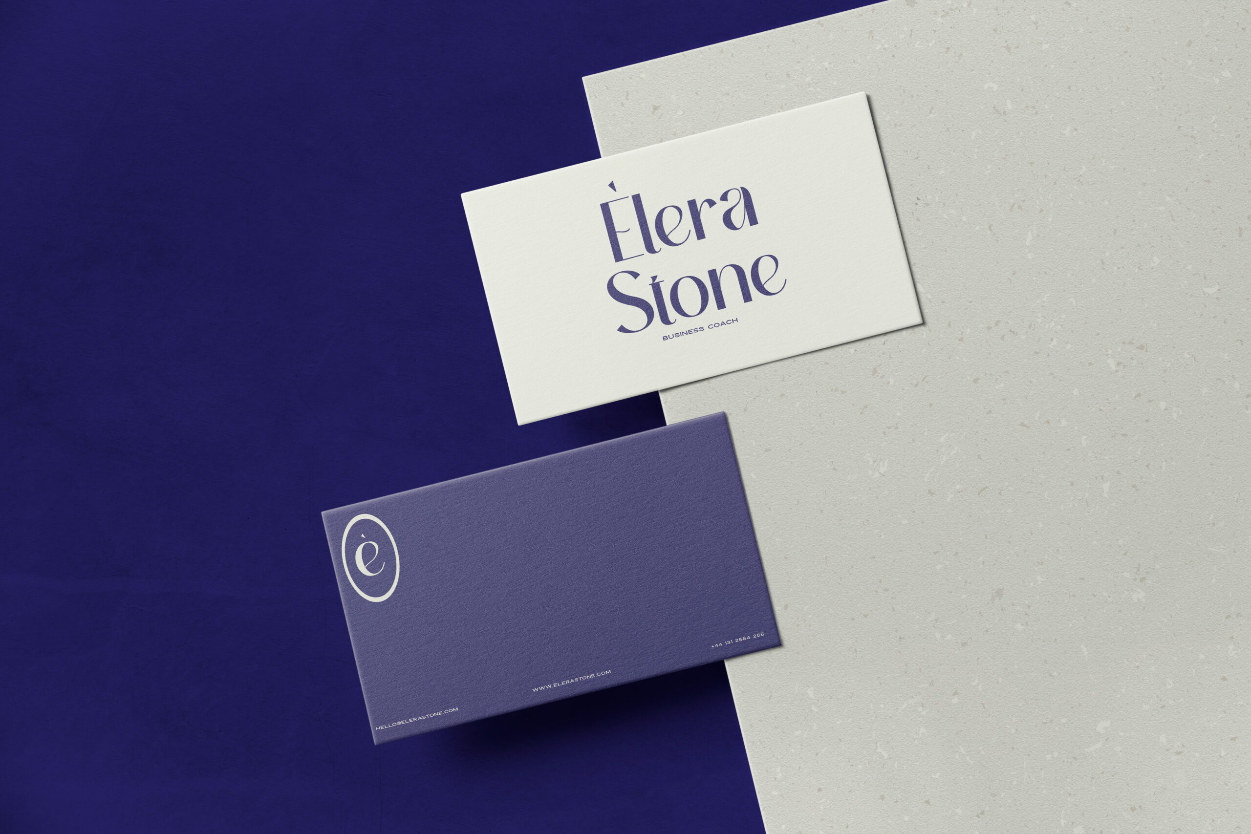
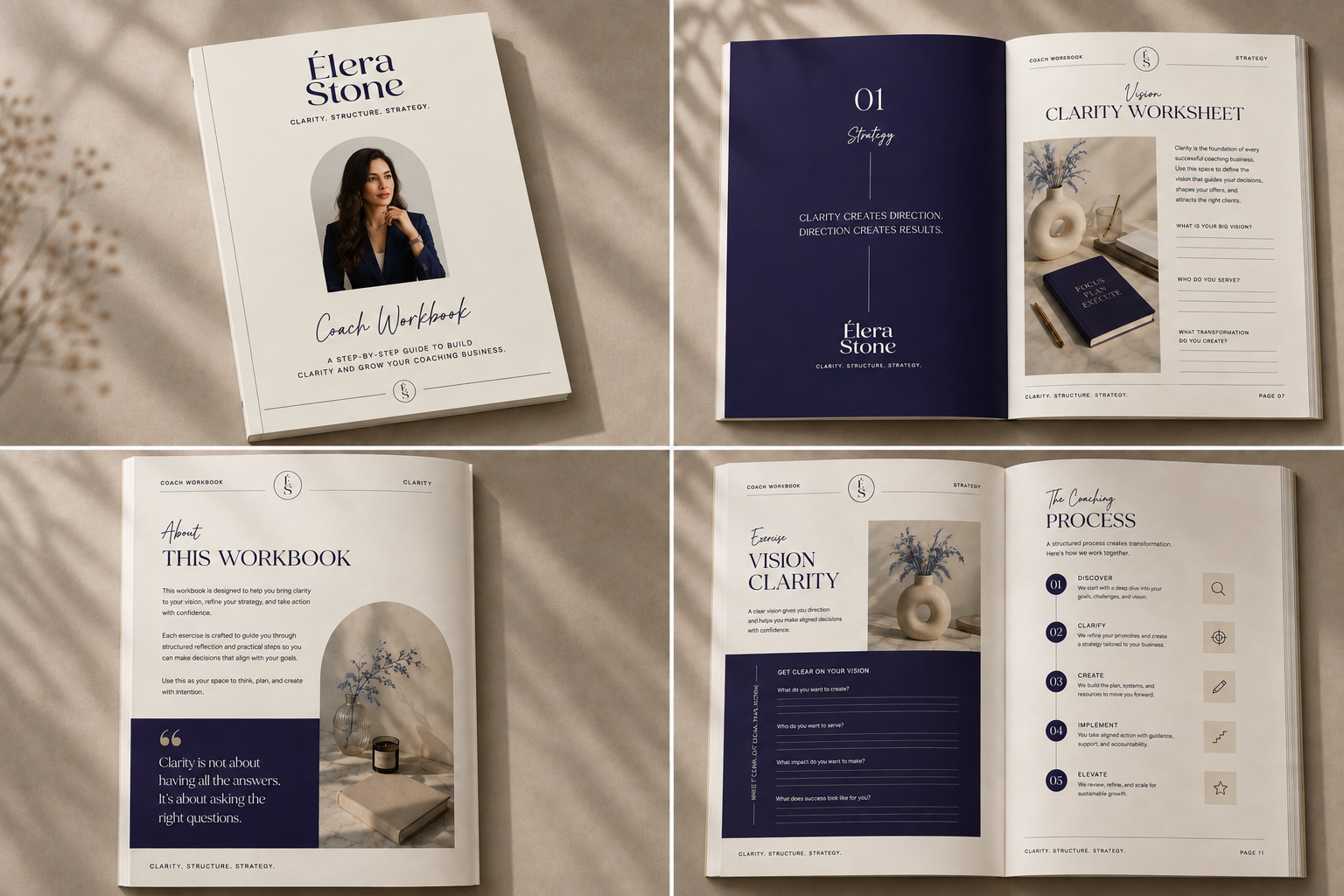
The new identity centres on deep violet and editorial restraint — a palette that communicates authority without volume. The typographic system uses a structured serif for headers and a clean sans-serif for body — signalling both intellectual credibility and modern clarity.
Every element was designed to answer one question: does this look like someone you would trust with a serious business decision?
The brand no longer competes with the generic coaching market. It operates above it.
Business Coach & Workshop Facilitator
Coaching & Professional Development
Brand Identity · Visual Strategy · Brand Guidelines
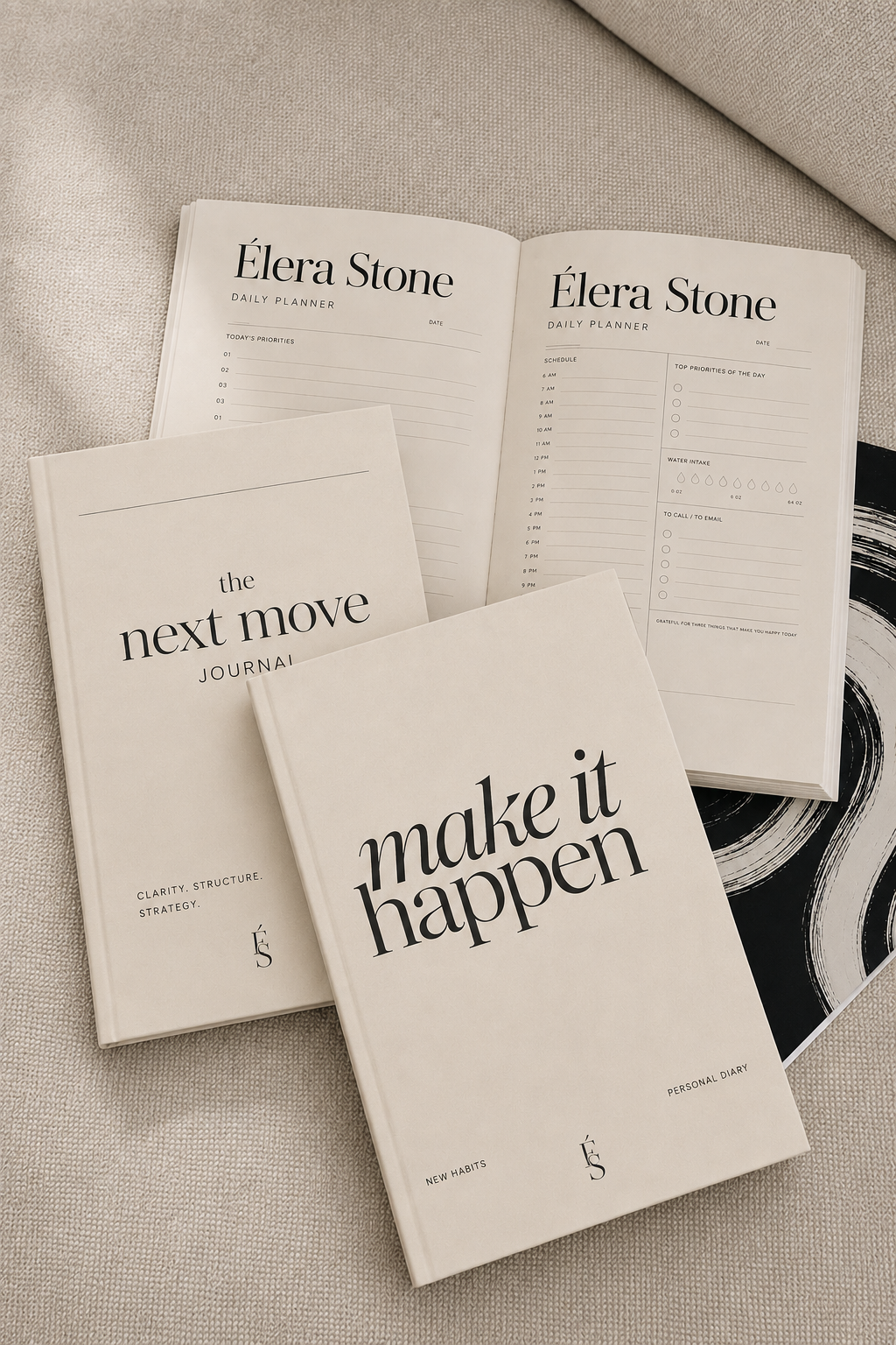
Logo Suite · Colour System · Typography · Stationery · Brand Guidelines PDF
Generic coaching aesthetic → Editorial authority
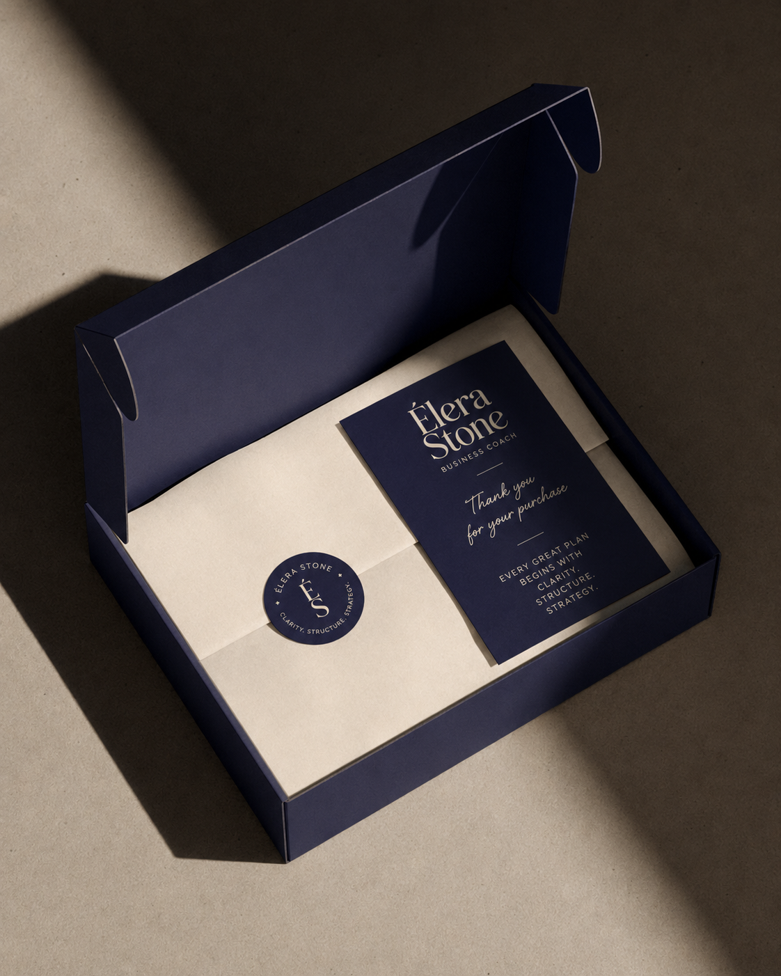
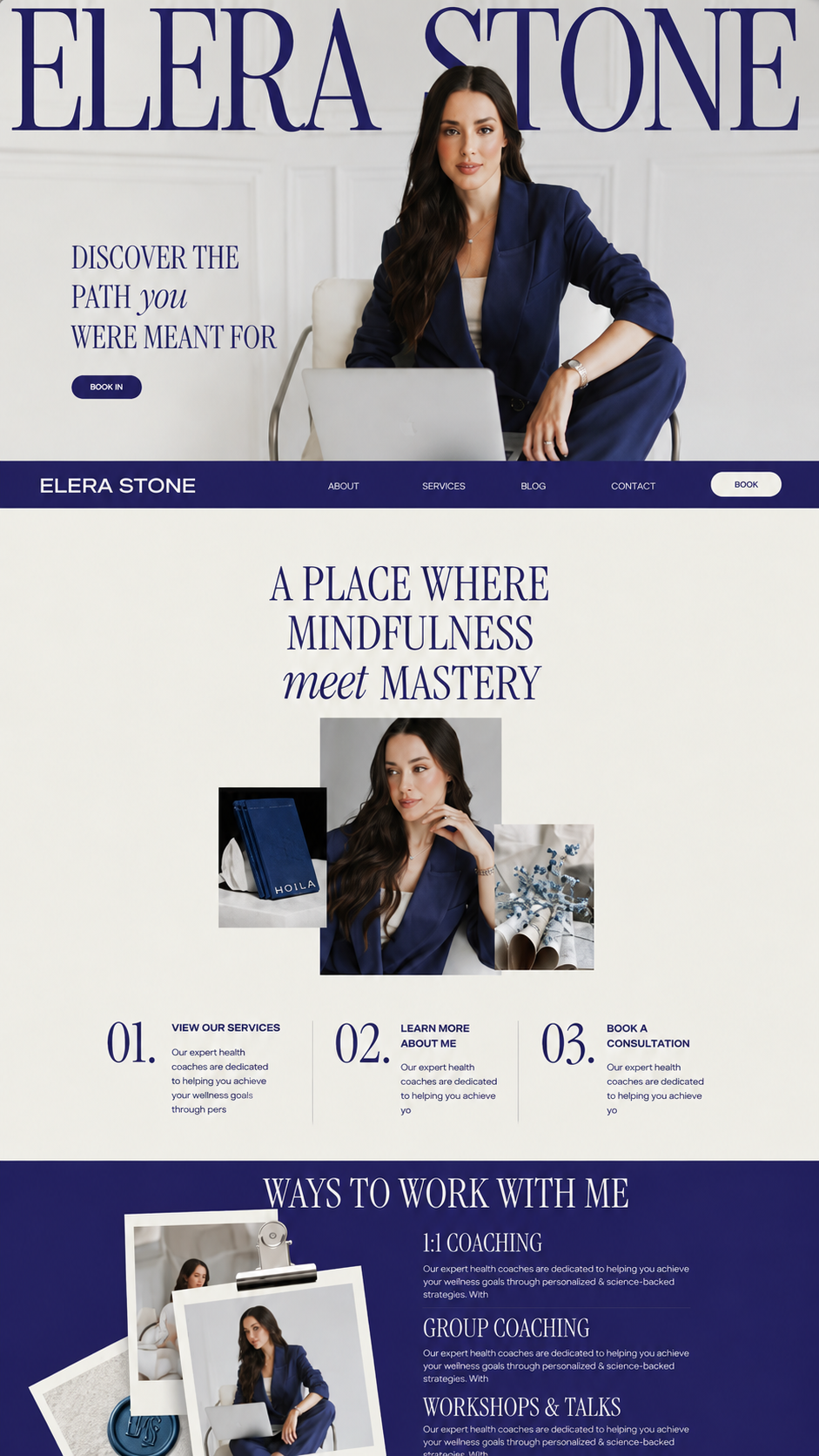
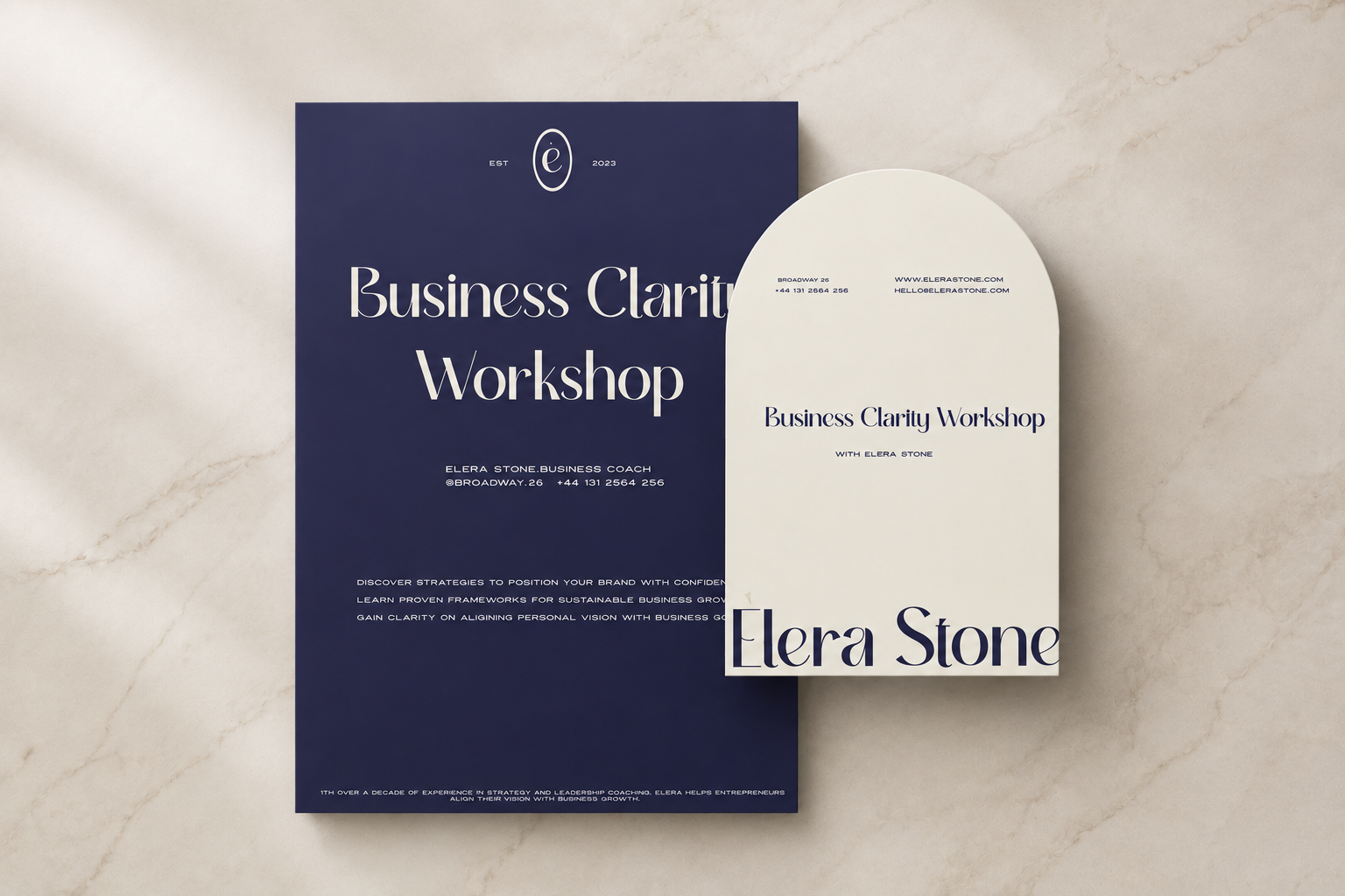

A business that looks like what it is — earns what it is worth.